General Information
This branded website is publicly available at Campher
This website was created by…
- Anjelina Pankova (ID: 230422)
Content
| # | Student ID | Value | Name and link of content |
|---|---|---|---|
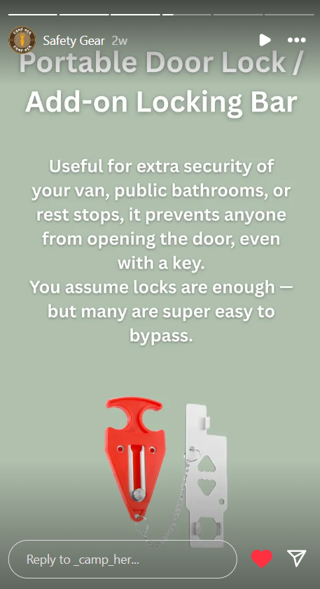
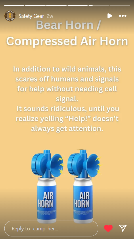
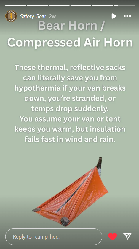
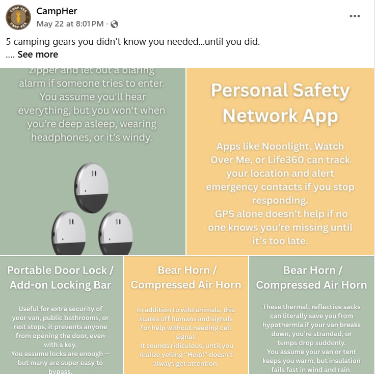
| 1. | 230422 | Homepage, Experiences Page, Safety tips page, Management section, Marketing campaign, Production section. All improvements for the retake were done by me. |
Homepage |
| 2. | 231186 | Logo and some interviews that can be found on the Appendix | |
| 3. | 231186 | Some interviews that can be found on the Appendix |
The brand's name:
The name CampHer immediately communicates the brand’s identity and purpose. It is a play on the word “Camper,” with the addition of “Her” to directly reflect the brand’s target audience: solo female travelers. By splitting the word into “Camp” and “Her,” the name highlights both the activity, which is camping and vanlife, and the empowerment of women who pursue it solo. It’s simple, memorable, and meaningful, supporting the brand’s mission to provide safety, community, and confidence to women on the road.
The brand's logo:
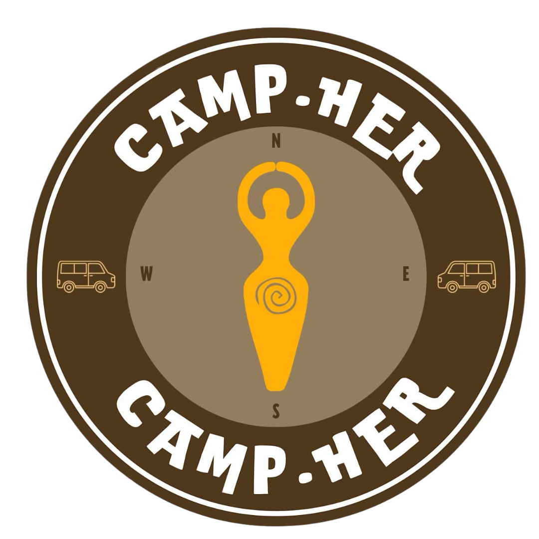
The CampHer logo clearly represents the brand by combining adventure, empowerment, and community. The round design gives a feeling of unity and safety, and also looks like a scout's badge. The bold, rounded typography conveys strength with a friendly, approachable tone. That same typography has been used for the marketing as well, in order to make people associate the posts with the logo. The central female figure symbolizes independence and confidence, reinforcing the focus on solo female travelers. The inclusion of camper van icons highlights the vanlife lifestyle at the heart of the brand. Altogether, the logo communicates CampHer’s mission to support and empower women on the road with clarity and warmth
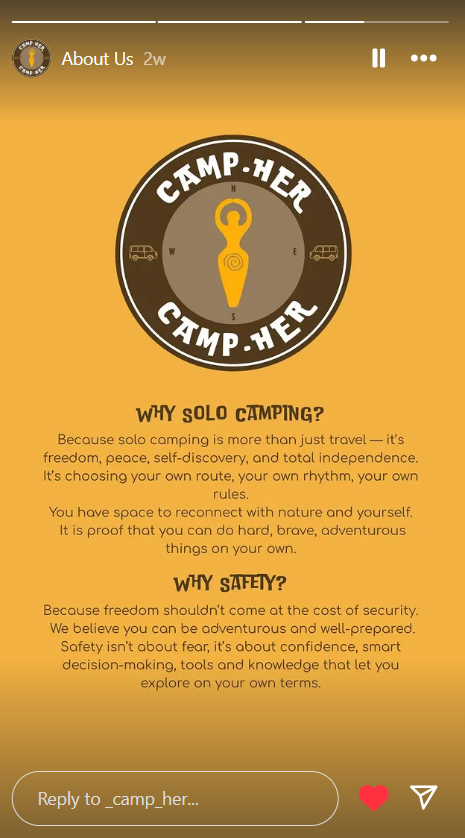
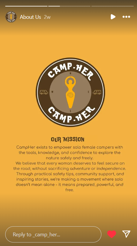
The brand's vision:
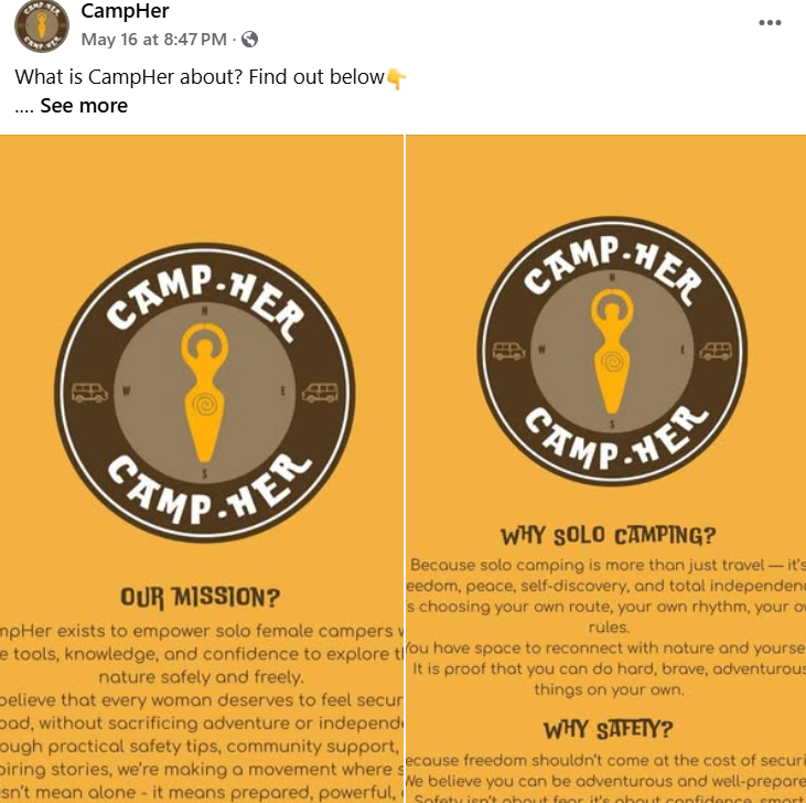
To create a world where solo female travelers can explore with confidence, freedom, and peace of mind. CampHer aims to empower women through a supportive community, practical safety tools, and inspiring stories, so every journey feels secure, authentic, and unforgettable.
The brand's values:
Safety - We believe solo camping should not feel unsafe and must be worry-free. From tips to gear recommendations, CampHer is built to give peace of mind on the road.
Freedom - CampHer supports independent travel and encourages women to embrace the open road on their own terms, whether it’s a weekend getaway or a long-term vanlife journey. Our community should feel free to explore every corner.
Authenticity - It is all about staying true to yourself. CampHer empowers women to share their real stories and embrace who they are without filters or pressure. It’s a space where vulnerability, honesty, and growth are welcomed.
Empowered community - Community is what turns CampHer into a movement. It’s about lifting each other up, learning from shared experiences, and knowing you’re not alone. Through making a community, CampHer wants to create genuine connection.
Production
Design Elements
Please provide a list of design elements alongside their justifications:
- Colour scheme:
- #8F7E62 The light brown signifies stability, reliability, and comfort. The light shade of brown gives an earthy, warm feeling that represents the softness of nature. It aligns with CampHer’s mission of offering a safe and cozy space for solo travelers. It reassures users that they are supported and understood. Used in the logo for contrast and the purpose of bringing those feelings to the users.
- #4C3921 The dark brown signifies strength and security. This deep, natural tone brings a sense of calm, confidence, and protection. It reinforces the safety and trust aspects of CampHer. Dark brown suggests a strong foundation, ideal for a platform helping women travel with confidence. Used for the logo, but also text on the website and social media posts to ensure maximum readability on light backgrounds. It is also softer on the eyes than black, reducing visual strain when reading while still maintaining strong contrast and making the brand look more consistent.
- #F3B23F The mustard yellow signifies optimism, courage, and adventure. The color is bright, inviting and energetic without being too much. It evokes curiosity and gives a sense of sunshine, new journeys, and happy moments. It communicates enthusiasm and calls users to action, perfect for buttons and highlights, encouraging engagement while keeping the visual elements consistent.
- #95A387 The green is a sign of trust, peace, and wellness. It brings a sense of balance, calmness, and connection to nature. It aligns with the outdoor, vanlife lifestyle CampHer supports. Green reassures users that this is a calming, friendly environment, far from stress and noise. It frames the site as it is used on the header and footer strengthening this nature-forward identity across every page. The purpose of using it as a background color on the Safety Tips is to evoke trust and bring peace as it might be a stressful topic, so harsh colors are avoided. This color is also used for modal backgrounds to reduce decision-making anxiety and maintain a sense of calmness. It makes these pop-ups feel like part of the environment rather than interruptions.
- Font choices:
The font used for the body text, buttons and descriptive content is Pangolin, a rounded, hand-drawn sans-serif that has legibility and a warm, human touch. This typeface reinforces CampHer's approachable and community-driven identity. For solo female campers, it is important that tools and platforms feel personal and inviting. Pangolin's playful curves and informal style create a sense of comfort, authenticity, and friendliness that are all essential qualities for building trust and emotional safety. Its handwritten feel also complements CampHer's value of community and shared experiences, making it ideal for a brand that prioritizes support, connection, and empowerment.
Quicksand is used for CampHer’s headings and titles to create a clear visual hierarchy while maintaining a friendly and approachable tone. As a geometric sans-serif typeface, Quicksand ensures good readability and a clean, modern look. Its rounded letters and balanced proportions, make it feel more welcoming and less formal. This aligns perfectly with CampHer’s brand values of accessibility, empowerment, and warmth. By pairing Quicksand with Pangolin, the design achieves balance, combining clarity and structure with personality and friendliness. Overall, Quicksand supports a visual that is both organized and approachable, ideal for a community-centered platform like CampHer.
Caveat is used sparingly for quotes and highlights in CampHer’s branding to add a layer of personality and authenticity. As a casual, cursive handwritten typeface, Caveat mimics natural handwriting, making messages feel more personal, almost as if they were written by a fellow traveler or a friend. This reinforces CampHer’s values of community, shared experiences, and emotional connection. The expressive strokes of Caveat make a visual contrast against the more structured Quicksand and Pangolin fonts, drawing attention to key messages without overwhelming the user. Its use adds a human touch that aligns with the brand’s mission to connect on a personal level with its users.
- User Interface Patterns:
The CampHer website is designed with a user-focused interface that supports its mission of empowering solo female travelers. The site’s layout and structure reflect the values of clarity, comfort, and community, offering visitors an intuitive and approachable experience. It is based on Bootstrap’s responsive 12-column grid, the layout adjusts seamlessly across screen sizes. On larger screens, content is often arranged side by side in two or three columns, making efficient use of space while maintaining visual balance. On smaller devices like mobile phones, the columns stack vertically, maintaining readability and function. This approach ensures a consistent and optimized experience no matter the device, enhancing usability for all visitors.
The navigation bar remains fixed at the top, allowing users to easily jump between sections like “Experiences,” “Safety Tips,” and “Corporate.” It helps orient users and minimizes friction when browsing. The footer is made the same color as the navigation bar to create a sense of framing, offering social links and a clear brand message, which reinforces consistency across pages.
Visual hierarchy is used throughout the site. Headings clearly separate content and help users identify key information at a glance. Elements such as buttons and interactive modals are used purposefully to encourage user action, whether it's joining the community or signing up for workshops. These components are strategically placed and styled to be inviting without being overwhelming. The buttons throughout the whole website are in the color F3B23F, and are made rounded with a hover effect. The color is noticeable and the effect adds a fun twist to it.
The CampHer homepage follows clear user interface patterns that support a smooth and engaging user journey. It begins with a strong visual in the hero section, a welcoming message over a campervan image, that immediately introduces the brand and its audience. Content is organized into clear sections like “About Us,” “Join Us,” and “Our Vision,” using a consistent grid layout that ensures readability across devices. The “Join Us” section stands out with a contrasting background, drawing attention as a clear call to action. A carousel displays key images that reflect CampHer’s values of freedom, adventure, and peaceful solo travel without overwhelming the user with visuals. These design choices create a logical content hierarchy and improve scanability. Finally, the quote at the bottom reinforces the brand’s mission in a calm, focused way, making a homepage experience that is accessible and easy to navigate.
The CampHer Experiences page uses a clean, card-based grid layout to showcase personal stories from solo female travelers, promoting community and trust. A welcoming header image sets the tone, while each card includes a photo, name, location, and testimonial, making content easy to scan and engaging. The consistent structure supports readability, and a clear call-to-action at the bottom encourages user participation. Overall, the layout is user-friendly and aligned with CampHer’s supportive community focus.
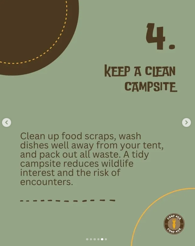
The hero section of the Safety Tips page uses a clean, vertical layout with a clear headline and subheading to immediately communicate what it is about. It follows strong UI patterns with concise text and supporting imagery for each tip, making content easy to scan and understand. Prominent call-to-action buttons ("Join a Workshop" and "Join Our Community") are visually distinct, encouraging engagement. The section maintains a good balance between clarity and information density.
Finally, the site demonstrates responsiveness and accessibility. Touch-friendly buttons, readable layouts, and interactive modals are all considered in the design. The CampHer website is built on UI principles: consistent structure, clear layout, responsive design, and intuitive navigation. These elements create a rliable and empowering space for solo female campers to feel supported, connected, and informed.
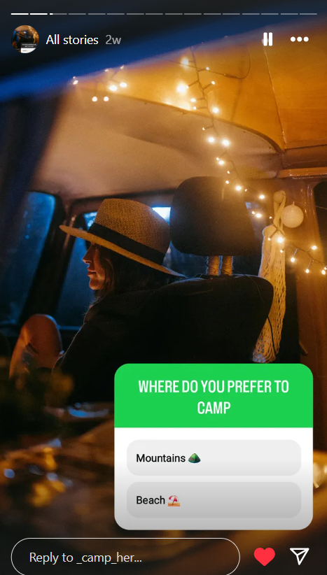
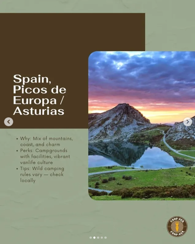
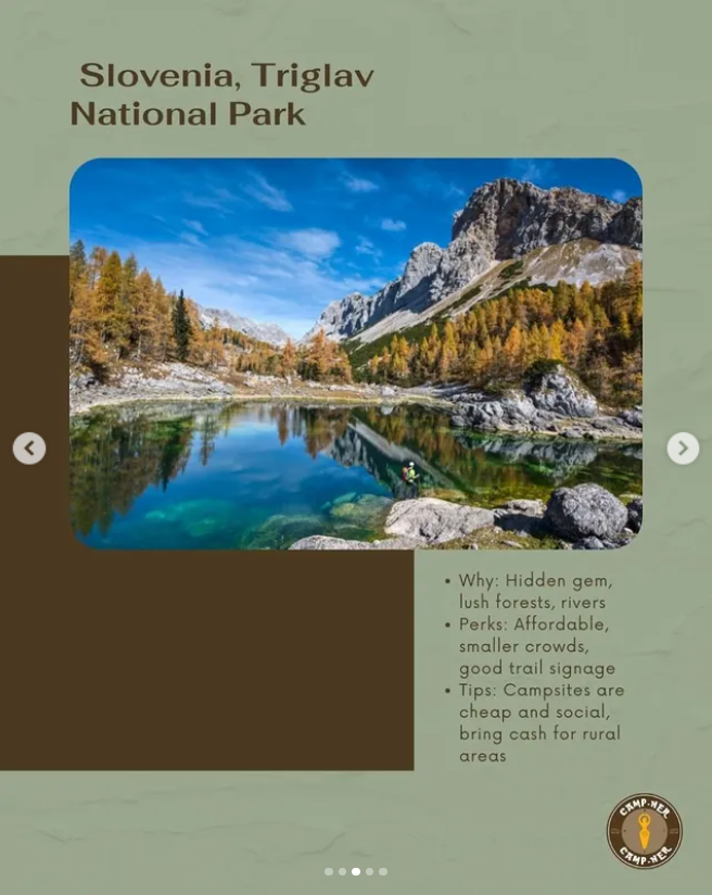
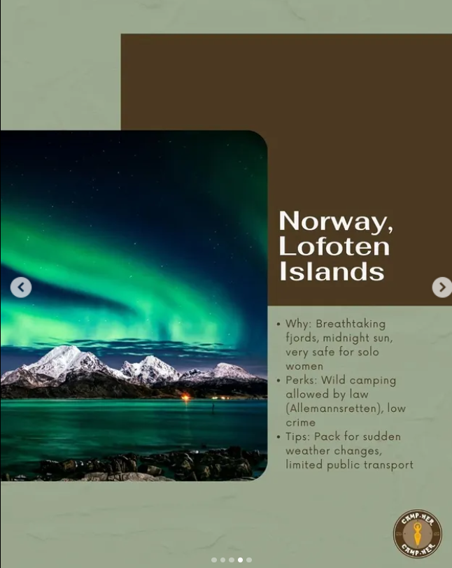
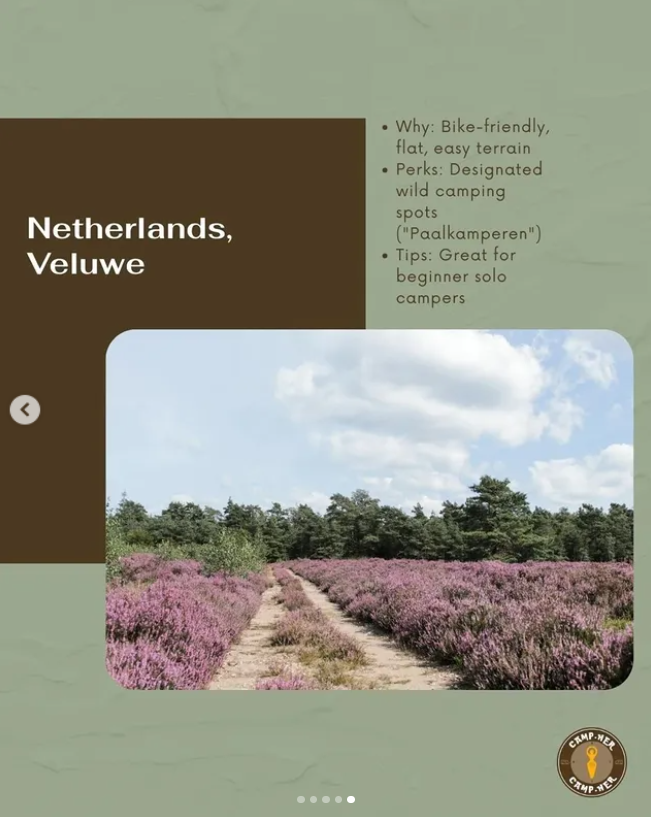
- All images on the website were taken from Pexels and Unsplash Welcoming Picture by Erik Schereder
- Pictures from Homepage Carrousel: First Picture by KúKú Campers, Second Picture by Clément Proust, Third Picture by Alex P.
- Experiences: Picture on top by KoolShooters, Marit picture by PNW Production, Sofia picture by PNW Production, Aleyuh picture by KoolShooters, Tess picture by Kampus Production.
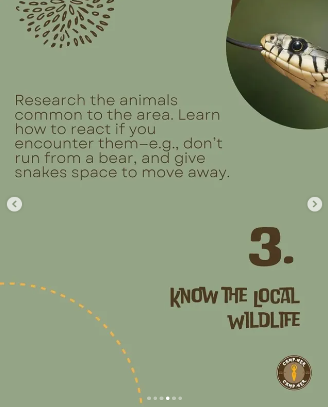
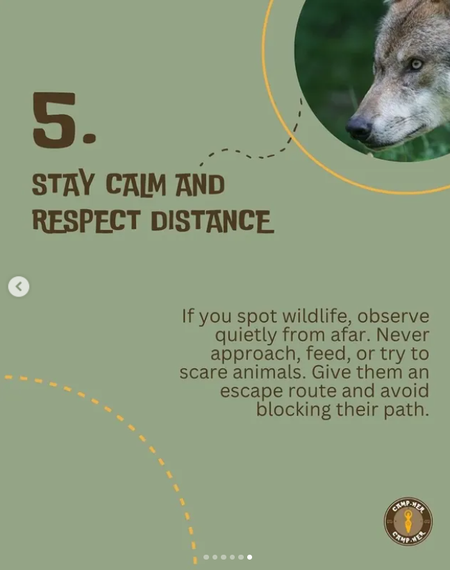
- Safety Tips: Picture on top by Alan Caldwell, Safe Locations picture by Lara Jameson, Knives picture by Araz Yurtseven, Group of campers picture by KoolShooters, Backpack picture by Darya Grey_Owl, Bear picture by Janko Ferlic, First aid picture by Mathias Reding, Northern Lights picture by Visit Greenland.
- The primary goal of the testing is to evaluate how effectively and efficiently the website is used, if the users can navigate through it without a problem when given tasks, and if it is visually resonant and aligned with the brand.
- To evaluate those aspects I ran tests with three participants, but unfortunately it was done only on a laptop. Another user told me it adapted well on a phone and really liked my website, but they tested it without my knowledge, therefore I do not have a video of it. The three participants on the other hand, were asked to introduce themselves and comfirmed their agreement to participate. Furthermore, they were given specific tasks they needed to complete independently, in order for me to see if users who know nothing about it can navigate it, and were also asked what they think of the website overall. Two female participants who like traveling were selected and one male, all in their 20s. I chose two participants that align with the target audience and one that does not, so I could hear both points of view. All of the testing was done in person and in the same setting. None of the participants were looking at the rest of the testing so I can see their ability to navigate the site when seeing it for the first time. From these participants I learned a lot and got insights on what I could improve.
- Results of the testing:
- No improvements were made to the current website due to time limit, but the overall feedback was mainly positive, so no big changes need to be made. If the project was to continue, I would implement the findings and expand the website.
Credits
Testing Report
Overall, all participants responded well to the visual aspect of the website.The first participant was asked to sign up and share their experience with the community. The test went well and the participant was able to complete the task quickly and without the need of help. A point for improvement is the "Share your story now" button. In the future I will make it stand out more by making it bigger and putting it on top of the page, so users know from the beginning how they can share their own story. The user liked the responsiveness of the website and the posibility to chat with the brand. Another positive feedback was that they do not have to read too much text.
The second participant was also asked to sign up and was given the task to join a safety workshop. From the get-go they completed the sign up and the feedback was that it is pretty straight forward. At first it took them a second to find where they could join a workshop from but they completed the task very quickly regardless. They were pleased with the site overall and gave a feedback that it is very easy to use. The thing I would improve is making the the two buttons at the bottom different colors and make it more prominent what they are about.
The last participant was asked to sign up as well, leave a comment on an experience and find the brand's Instagram page. They signed up without a problem, and it only took them a second to find the experiences button. The managed to find the comment section successfully and quickly. Due to the intiutive design of the website, they were able to guess where the Instagram buttton is immediately. They navigated without a problem and gave a positive feedback. A thing I would improve is make the buttons on the navigation bar more prominent and bigger so they can be easily noticed.
Marketing
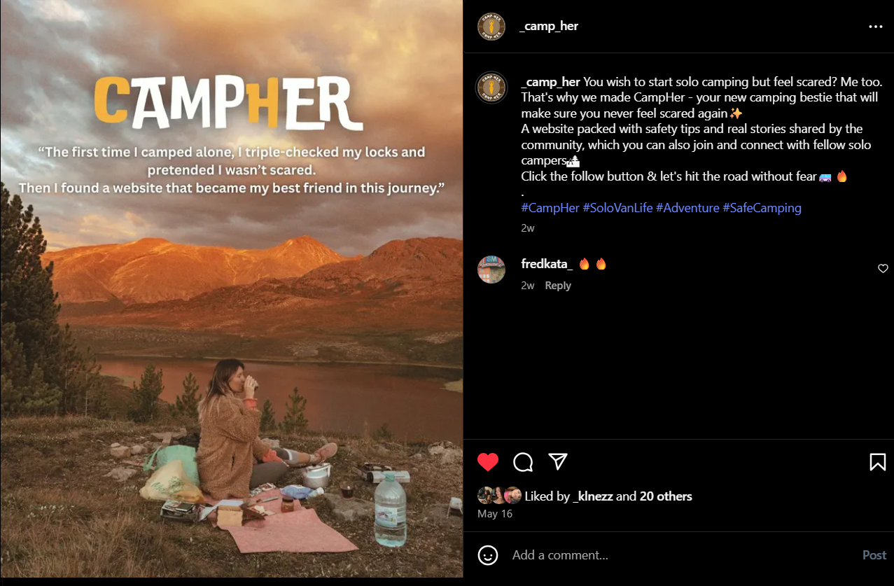
Context of campaign and promotional activities
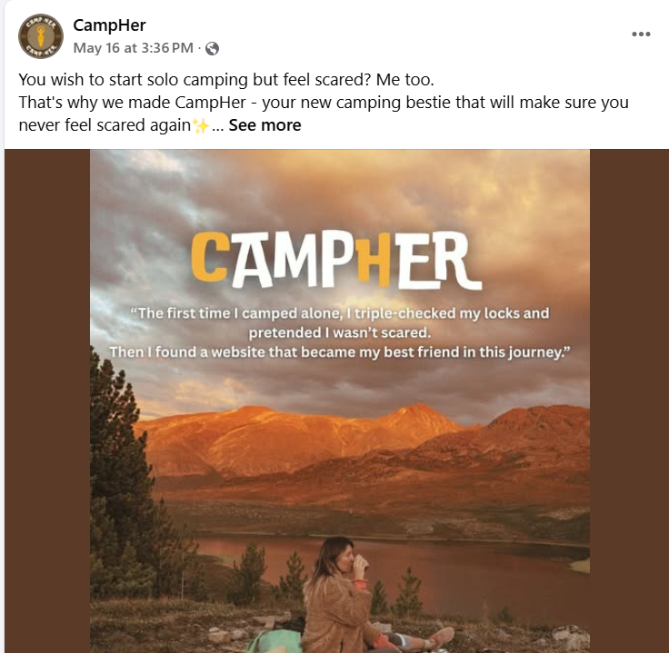
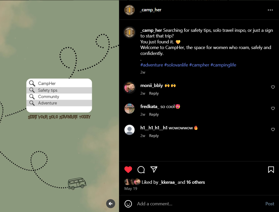
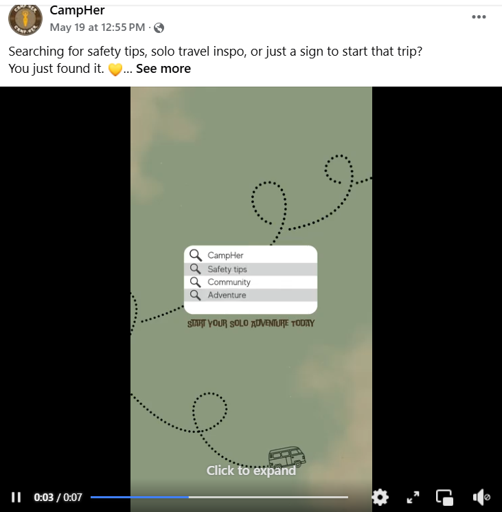
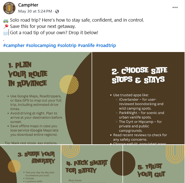
The CampHer marketing campaign was executed in the period between 16th of May 2025 and 30th of May 2025. I wanted to raise awareness about a brand aimed at the safety of solo female travelers and the launching of a website where they would be able to find safety tips and join a community full of solo female travelers. I wanted to portray it as a friend that will always have your back and a community you can always turn to and share with. The campaign was executed on social media and the channels used were Instagram and Facebook. Those social media platforms were chosen, because the target group consists of Gen Z who use mainly instagram, and Millenials, who also use mainly Instagram but the elders of the generation are also on Facebook.
The campaign messaging focused on confidence, connection, and freedom, positioning CampHer as both a practical tool and emotional support. The brand’s tone was friendly, inspiring, and approachable like a fellow solo traveler that shares their story with the reader. It was used to give useful information and start building a loyal community.
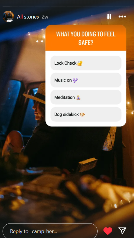
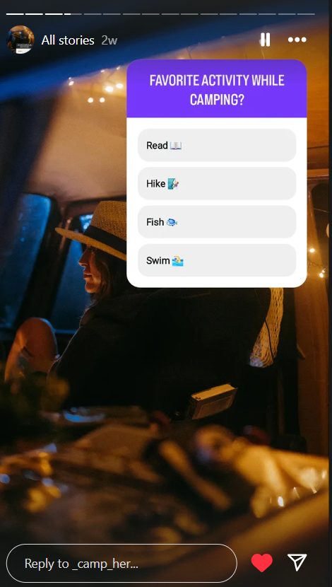
Three main objectives were set. First, to build brand awareness by engaging at least 40 users, and have at least 100 interactions measured through post engagement (likes, shares, comments, saves). To do this, I posted about the brand’s mission and gave them a feel of what to expect on the website, as well as interactive posts where they could vote on polls or ask questions. I posted safety tips, destination recommendations, gear recommendations and a guide how to plan their solo trip. Fun polls were created to boost engagement, and I answered to their questions to gain trust and make it more personal.
My second marketing goal was to reach 300 accounts, get at least 75 followers on Instagram, and 10 likes on the Facebook page. I kept the goals realistic because the campaign was short and our audience is pretty niche. Instagram was my main focus since it is more popular with Gen Z and they spend more time on social media. Facebook had a smaller goal because it is harder for people to find the page, and it is used more by older generations, but I still wanted to include it to go beyond just Gen Z and younger Millenials.
The third goal was to focus on posting mainly educational and informative content. I aimed for at least 60% of our posts to be helpful tips, safety advice, or vanlife inspiration that solo female travelers could actually use. The idea was to build trust with the audience and position CampHer as a reliable and supportive platform, not just a brand. The rest of the content was meant to be more fun or community-focused, like user stories or polls.
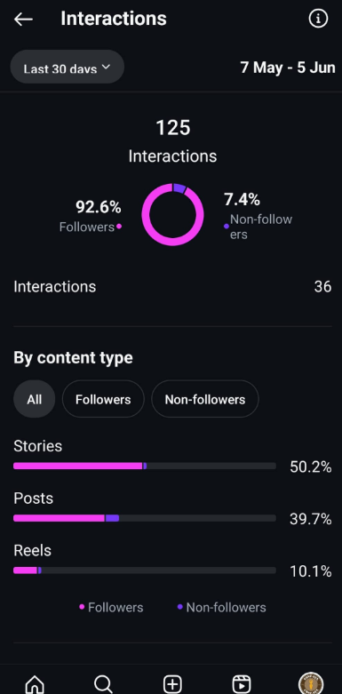
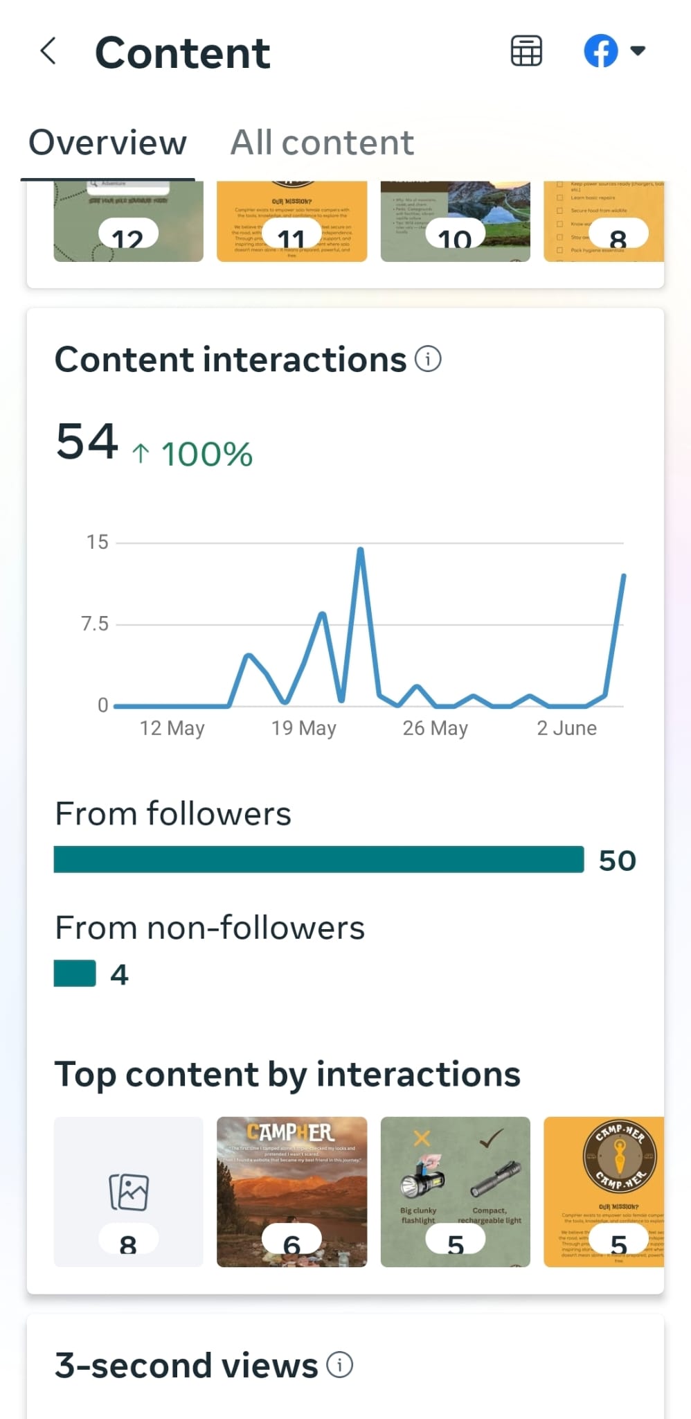
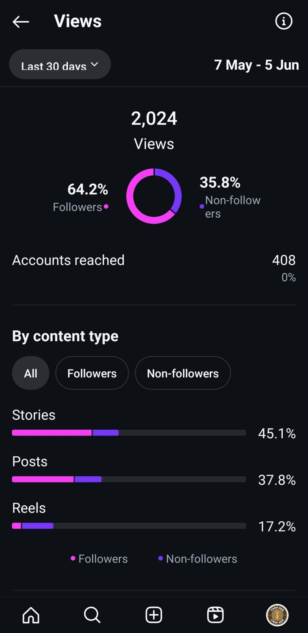
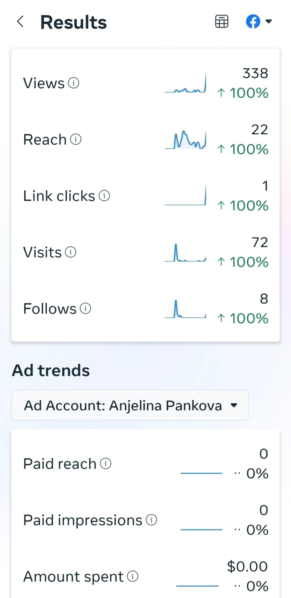
At the end of the campaign I was able to reach most of the goals. I managed to engage 36 accounts on Instagram and at least 8 accounts on Facebook. Furthermore, there was a total of 124 interaction on Instagram and 52 interactions on Facebook, which makes the first objective of the campaign met. The accounts reached on Instagram were 408 and on Facebook 21, which makes the reach goal met. Unfortunately the Facebook page gained only 8 likes, which means only the Instagram goal was met and exceeded, while the Facebook one was not. The third goal was met as well, as the posts were mainly about safety tips, gear recommendations and answering questions, while the rest was interactive polls, and stories shared by the followers.
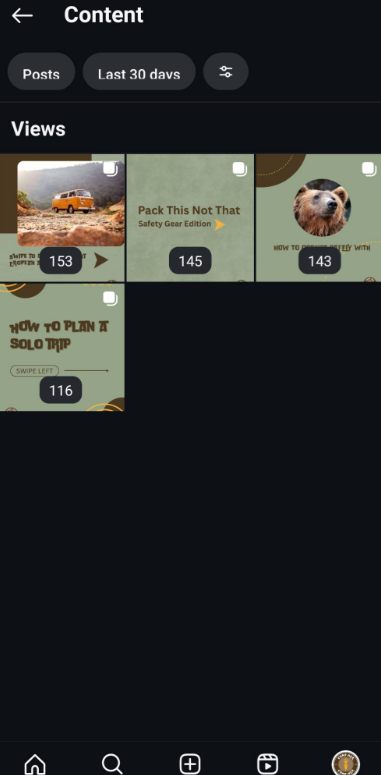
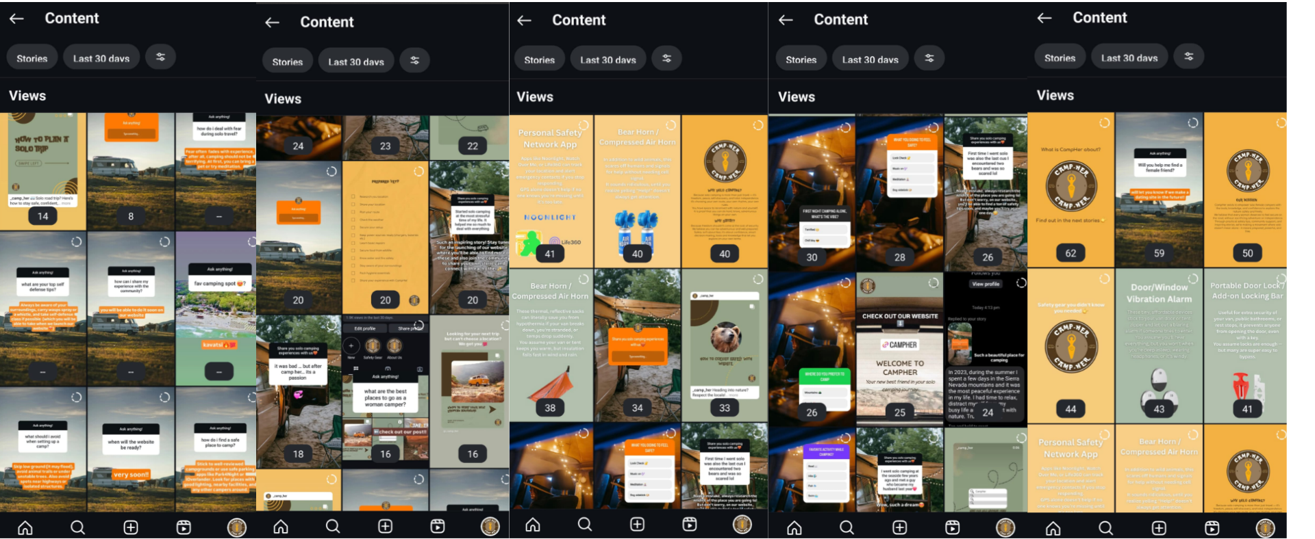
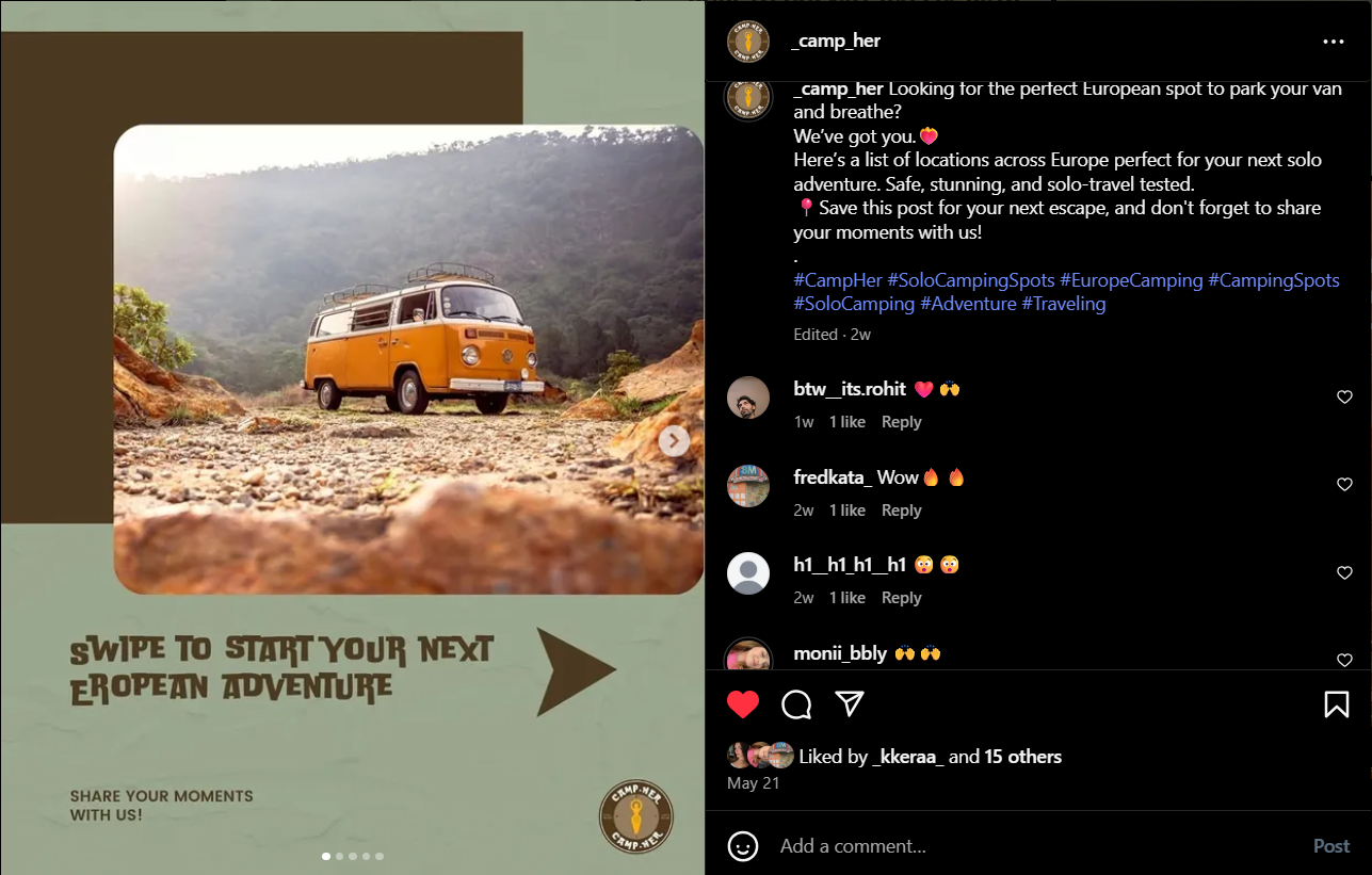
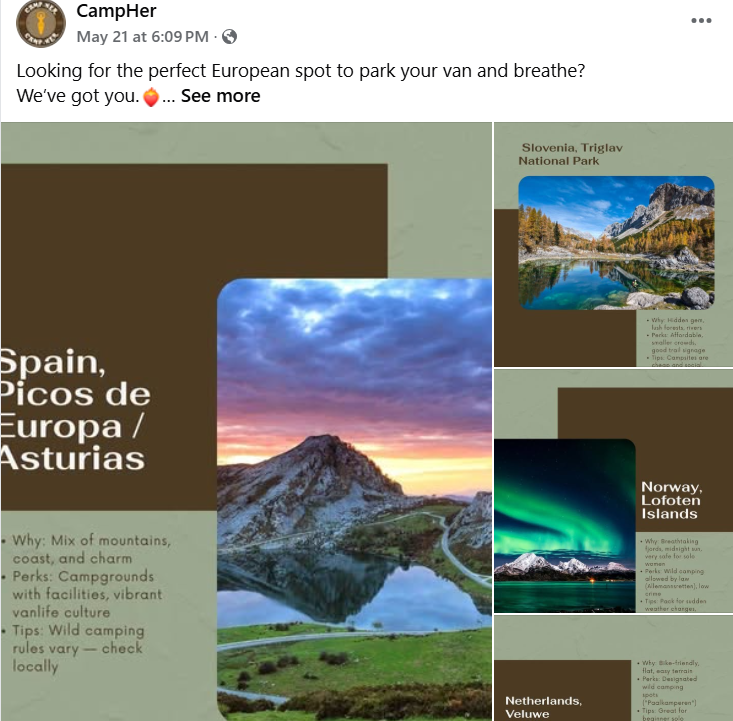
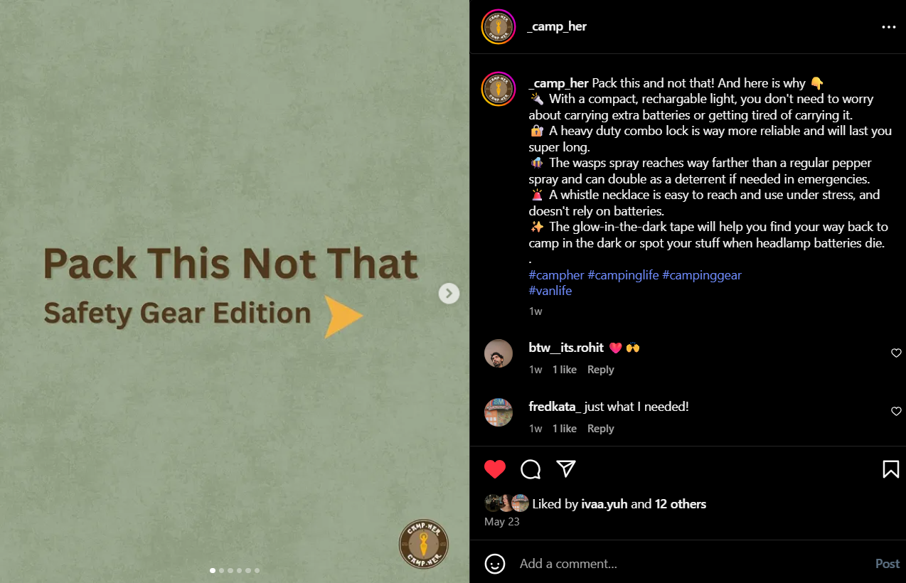
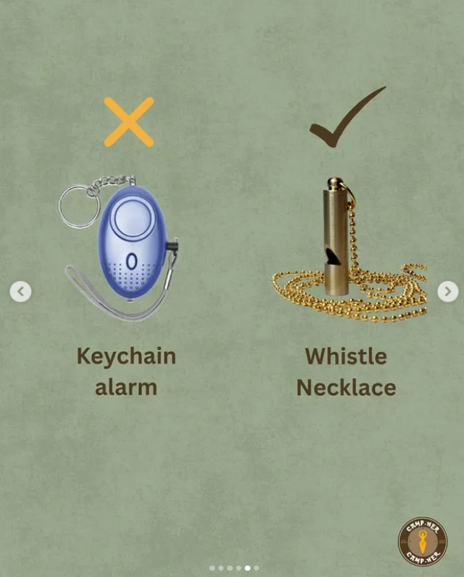
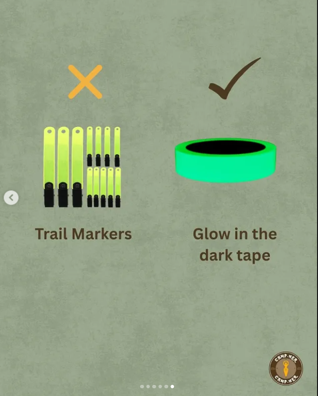
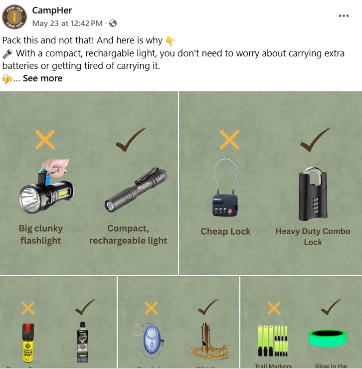
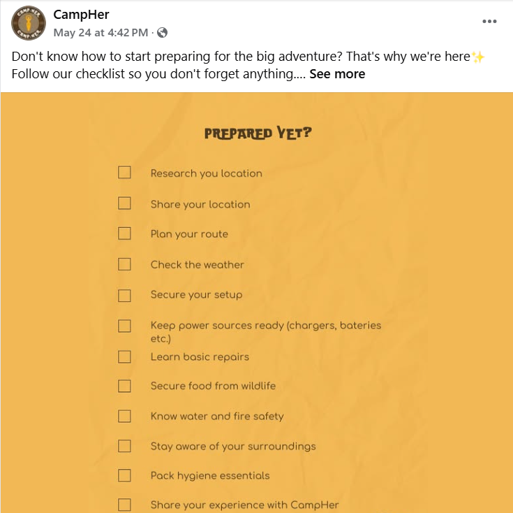
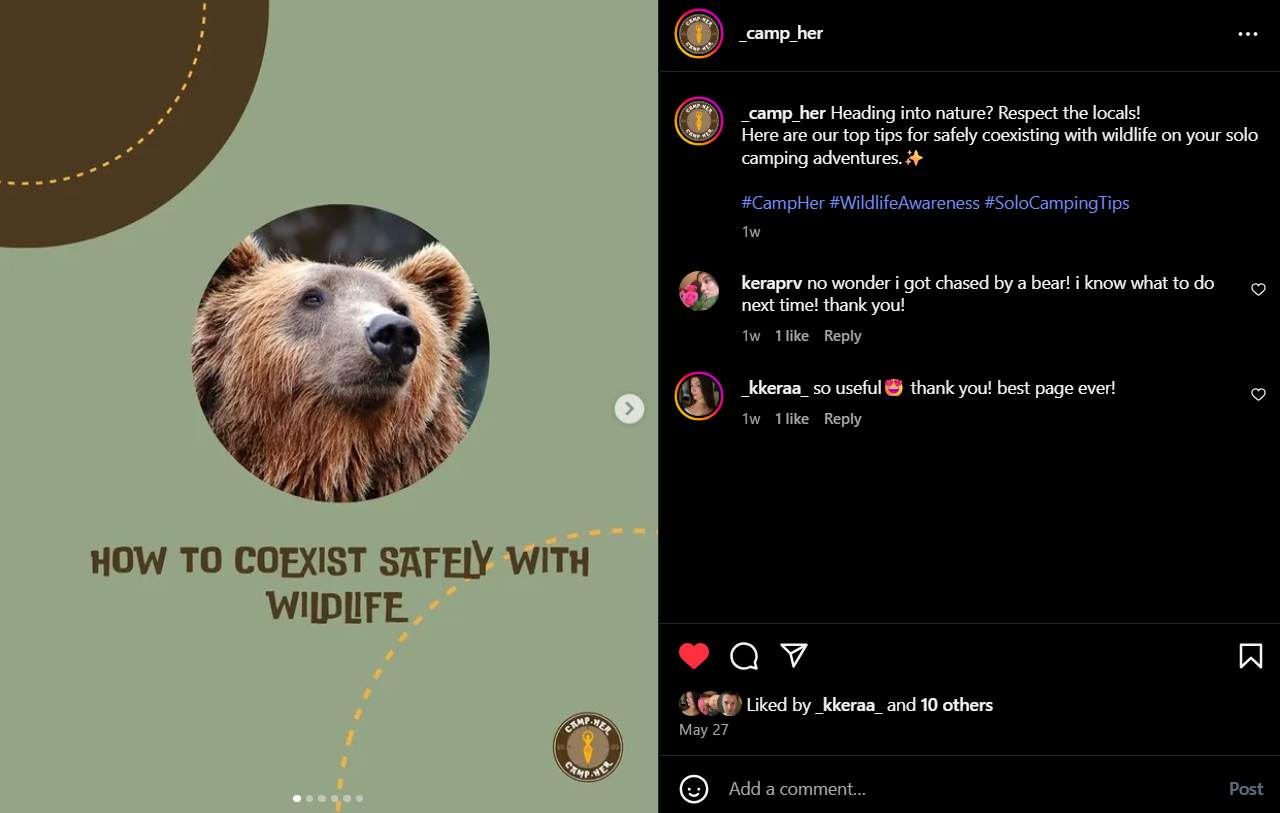
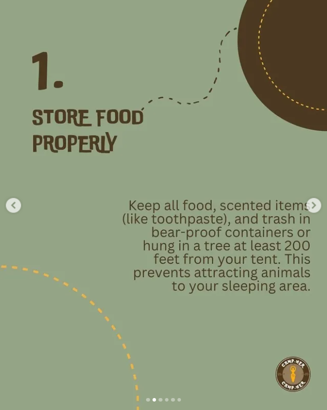
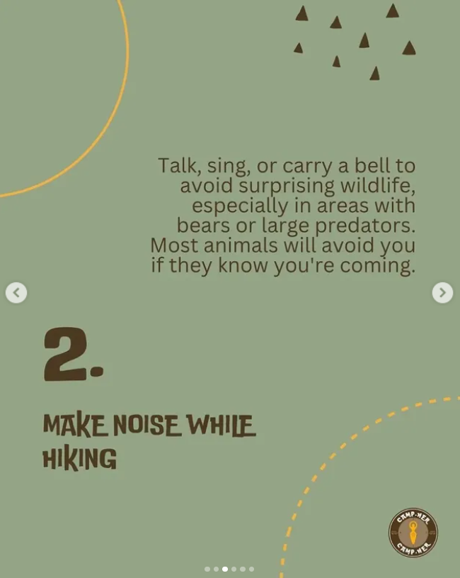
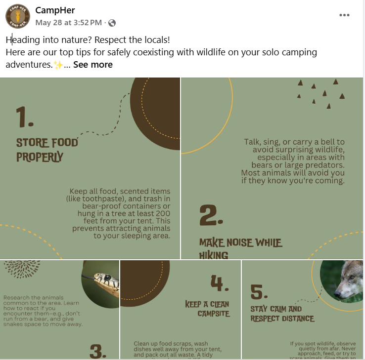
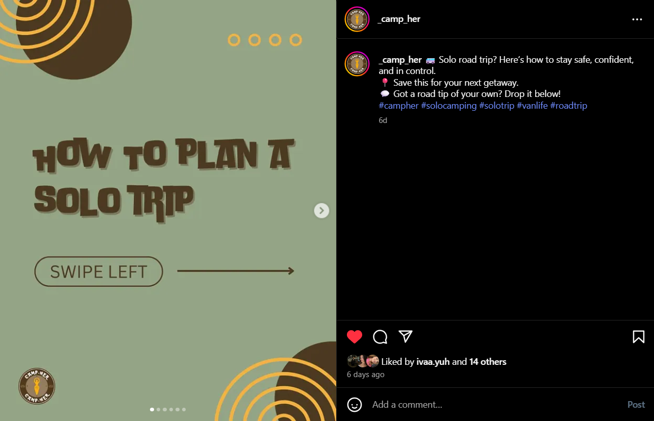
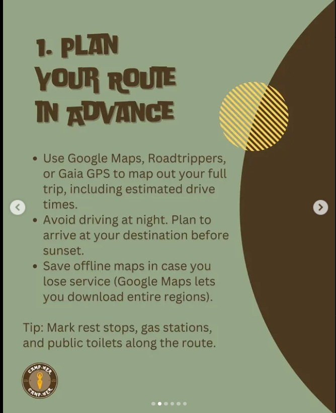
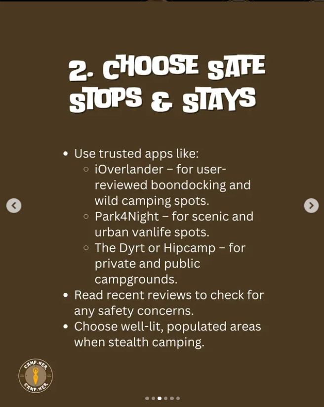
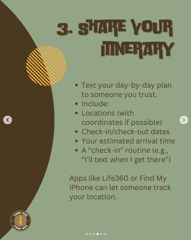
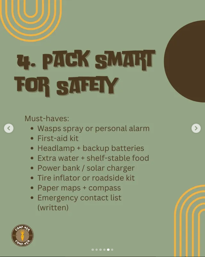
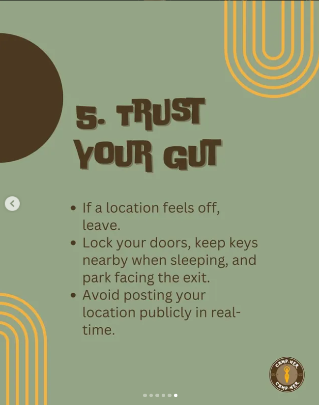
The campaign goals were achieved through consistent content planning. A content calendar (See in the Appendix) was created to ensure regular posting of at least three posts per week, and Instagram Stories were shared almost daily. The content strategy focused on maintaining audience interest with visually appealing carousels that encouraged viewers to swipe through connected elements. The first few posts introduced the brand and explained its mission. These were followed by helpful and engaging content like "Pack This, Not That", "How to Coexist with Wildlife", "How to Plan a Solo Trip", and location recommendations. All of these were shared as carousels on both Instagram and Facebook to maintain the same presence across platforms.
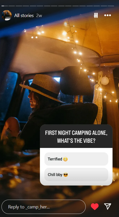
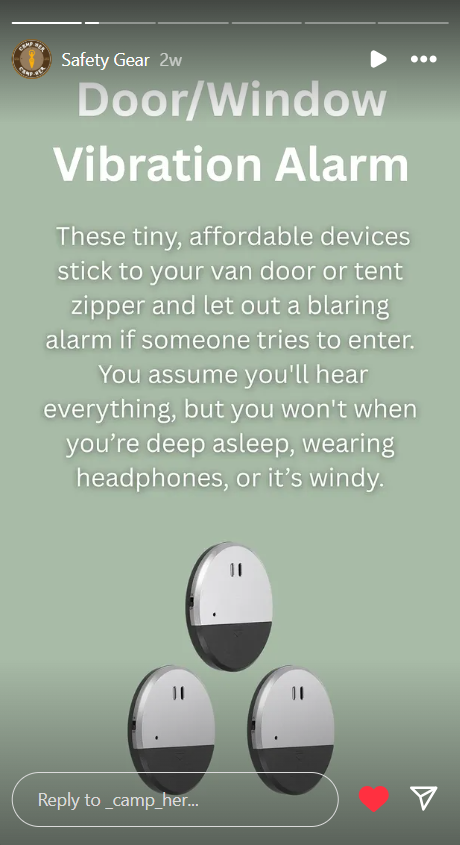
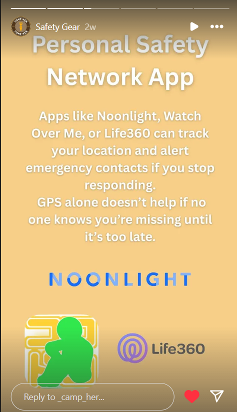
On Instagram, Stories played a key role in boosting engagement. Highlights were used to showcase safety gear tips and brand's mission so new followers could easily catch up. While Stories are less viewed on Facebook, the same content was posted as regular posts to keep the feed active and informative.
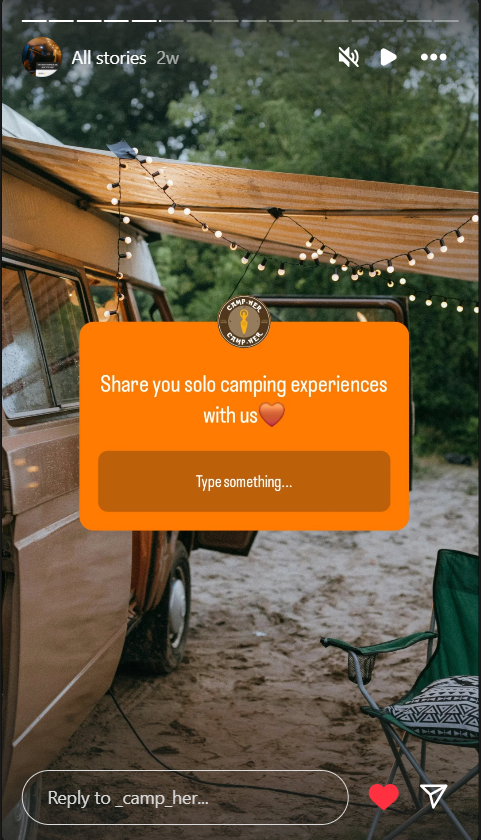
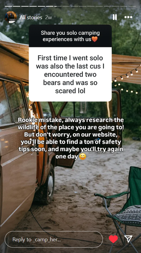
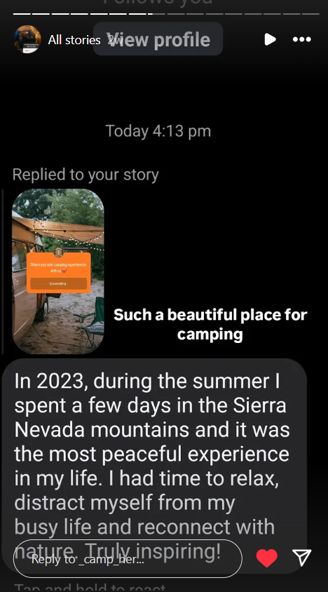
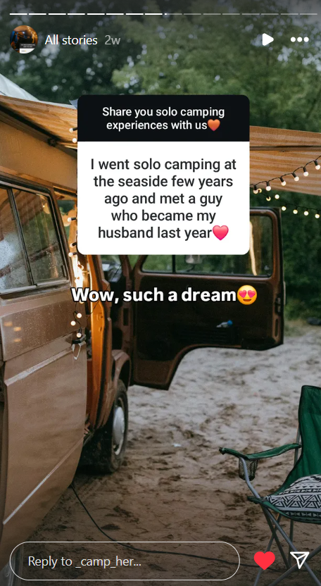
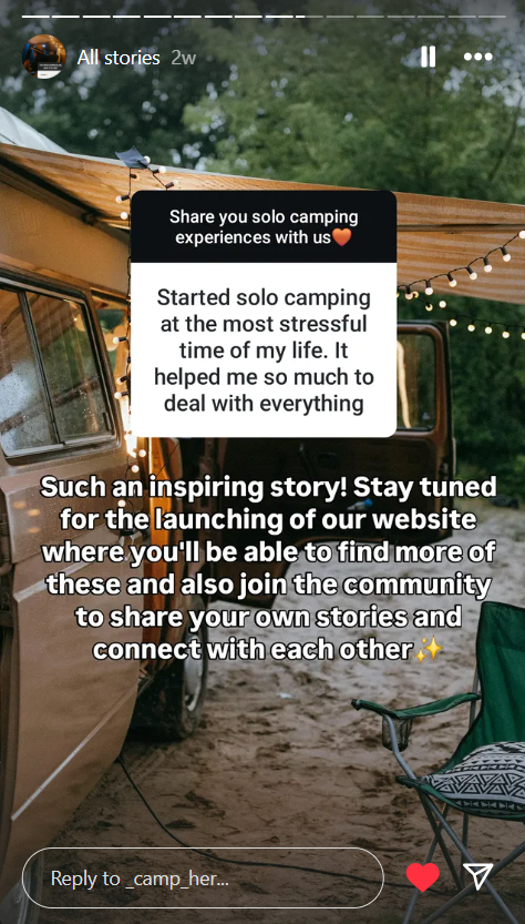
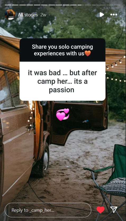
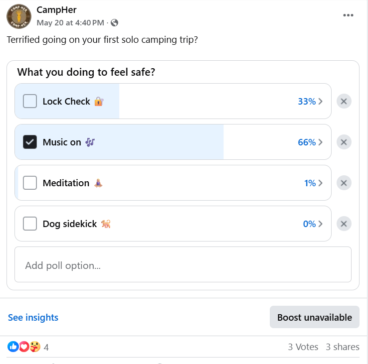
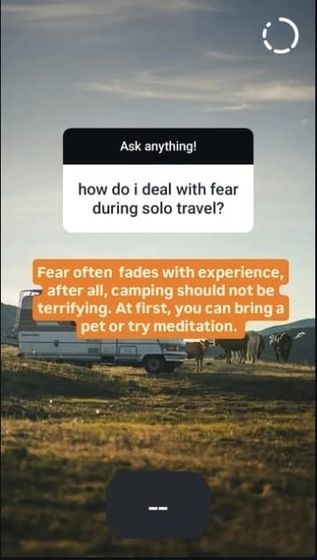
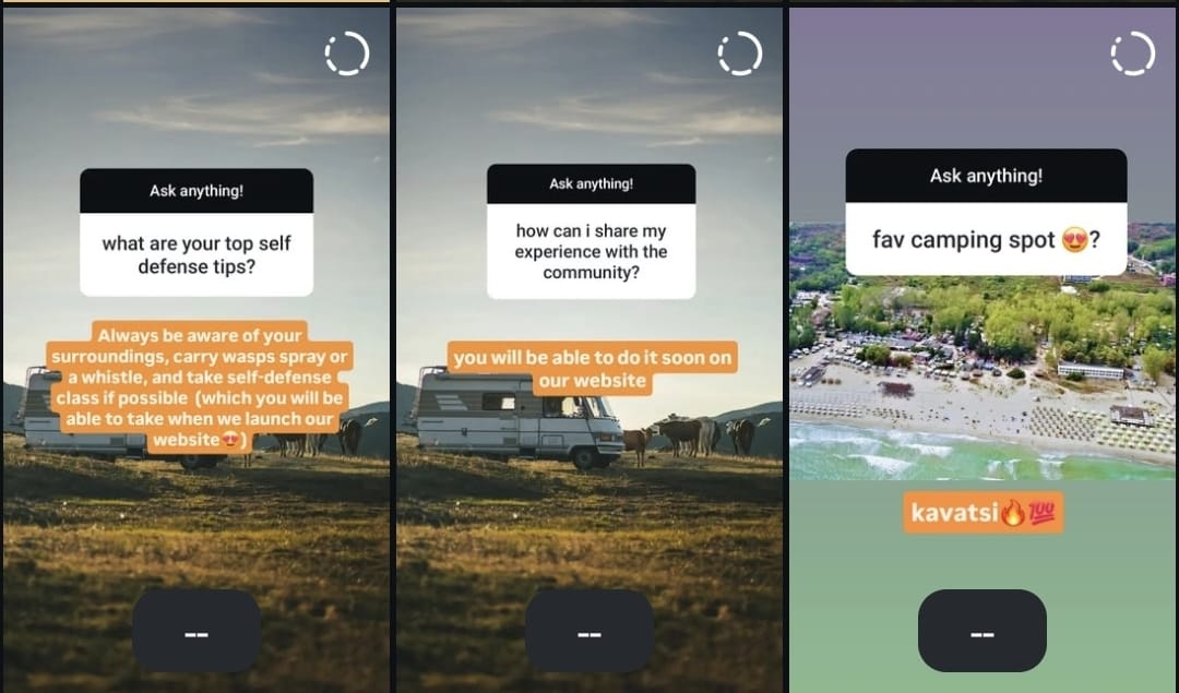
Interactive features were also included, mainly through Instagram polls and Q&As. These asked followers about their camping habits and encouraged them to share personal stories, which were then reposted to build a sense of community, which directly connects to one of CampHer's values that is empowered community. It also directly relates to the website function where people are able to share their stories. The Q&A consisted of asking followers to ask me questions and I answered them. That gave a sense of authenticity which is another one of the brand's values. Polls were primarily used on Instagram to avoid cluttering the Facebook page with too many similar posts.
All of the posts' designs followed CampHer's main colors and used the logo's font, so everything is connected and consistent.
Learning Points
With this project I gained valuable insights into social media marketing, especially with a niche audience. The biggest challenge I faced making it was that I was all alone and had to stay consistent. Maintaining consistency in posting while also handling website redesign, content creation, marketing strategy, and production independently was extremely difficult. At first I was making the posts in the day they were scheduled for, but quickly I learned that I do not always have time for that. After the fourth day, I made as much as possible posts in advance and that is how I was able to post it on time. This project highlighted the importance of time management and the limits of working alone. Although it was hard, I am happy about the things I got to learn about social media and making people intrested in the content. In the future, I will collaborate better with other people on such projects in order to be more efficient.
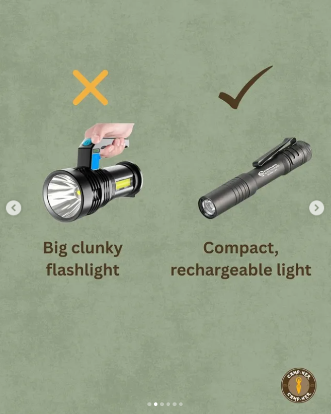
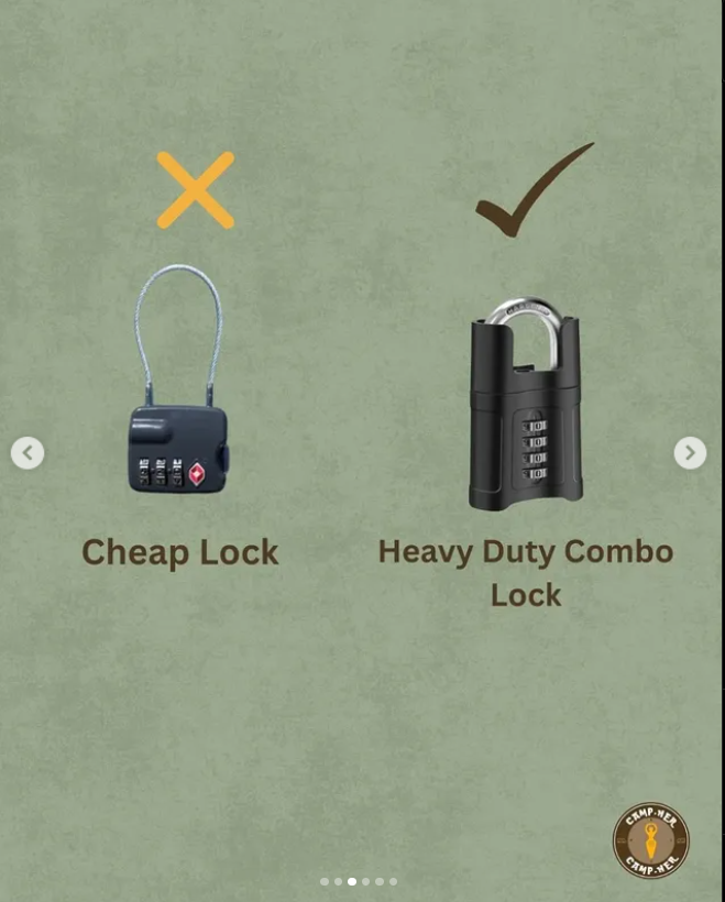
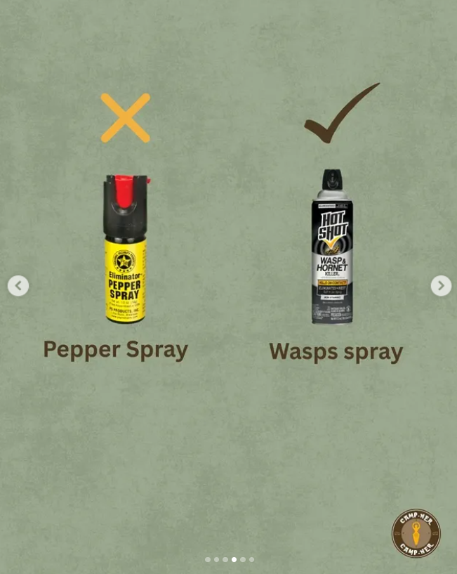
Another challenge I faced in terms of making the content, is coming up with ideas that do not repeat or add little twists to it and still align it with the website and the brand. Of course, the website is mainly about safety tips and sharing personal stories, but posting only about that on social media is going to get boring and rpetitive. To overcome the challenge, I started thinking about how I could make different content with similar information that is still useful and engaging. It can be seen in the gear posts. Even though both the stories and the post were talking about gear, I made the stories simple and direct, while the post was more like a game "pack this, not that" and they both completed each other with information about the same thing. That experience made me learn that you have to constantly think of ways to switch things up in order to keep the audience intrested and come up with topics similar to the main topic, like the posts about destination recommendations and checklist on how to prepare for a solo trip.
The third thing I learned is that niche audience engagement is more challenging than expected. Reaching and engaging a niche audience requires more than just consistent posting. Although the message and visual branding of CampHer were strong and clear, overall engagement (likes, comments, and shares) was lower than expected on Facebook. It proved to be much more difficult to grow there, especially for a Gen Z and Millenial focused brand. Reaching and engaging users on this platform was slower and less effective than on Instagram. Despite the challenges, Instagram exceeded expectations in terms of followers and reach. The community there responded positively to the tone and purpose of the brand, showing that good messaging and visuals do work effectively. For only two weeks my page managed to exceed the following of the previous try on this project that lasted a whole month. My takeaway from this lesson is that strong visuals alone do not guarantee engagement. You ned to study your audience in real time and change strategies if needed.
Overall, this campaign taught me that a clear message and good design are a strong foundation, but strategic planning and team support are just as important to succeed.
Future Planning
Reflecting on this project, there are a few things I would change if it were to continue. Firstly, I learned that collaboration is crucial for big projects like this. Trying to manage everything, from strategy and content creation to website updates and social media execution, by myself was difficult phisically and mentally. In the future, I will make sure to work in a team, dividing responsibilities to increase both efficiency and quality. Collaborating with others will also open more room for brainstorming and input, which helps avoid repetitive content.
Secondly, planning and time management will be a priority. At the beginning, I created posts on the day they were due, which quickly became overwhelming. After switching to making content in advance, everything became more manageable. Going forward, I’ll continue using this strategy and develop a proper content calendar that includes time for last-minute adjustments or new ideas.
Furthermore, I will focus on content variation and creating a balance between consistency and creativity. This project taught me the importance of making similar content feel fresh and engaging. For example, using different formats like carousels, games, or polls helped maintain user interest even when covering the same topics. I will keep experimenting with formats and storytelling to avoid repetition while staying aligned with the brand’s identity. I will also focus more on engaging content and calls to action to attract more people to engage with the page. Potentially, I would explore additional outreach strategies such as influencer partnerships, collaborations, or targeted ads to improve reach and engagement. Good design and messaging are important, but they need to be paired with strategic promotion and real-time audience analysis.
Lastly, I now understand that audience behavior is different on every platform. Facebook was harder to grow on, while Instagram delivered higher engagement, especially with Gen Z and Millennial audiences. In future campaigns, I will tailor content specifically for each platform instead of reposting the same material. For example, Facebook may be better suited for informative posts and community updates in groups, while Instagram should focus on visual storytelling, reels, and interaction through stories and polls. I will also be analysing the audience behavior in real time to determine what posts I should continue doing and what not.
In summary, my future campaigns will involve better planning, team collaboration, strategies based on platform, and experimentation to keep the content fresh and engaging. This experience has helped me grow in confidence and skill, and I would love to apply it in the future.
Professionalism
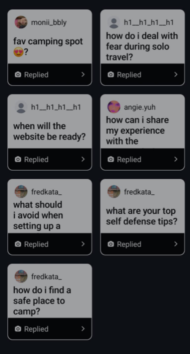
All posts and stories on the Instagram and Facebook accounts in chronological order. Also links to the Instagram and Facebook profiles. Each of the pictures is also a link to their respective post. That is not possible with Instagram stories, therefore the pictures lead to a highlight with all of them.
Posted on 16.05.2025
-
-
-
-
-
-
-
Posted on 19.05.2025
-
-
-
-
-
-
-
Posted on 20.05.2025
-
-
-
-
-
-
-
-
Posted on 21.05.2025
-
-
-
-
-
-
-
Posted on 22.05.2025
-
-
-
-
-
-
-
-
Posted on 23.05.2025
-
-
-
-
-
-
-
-
Posted on 24.05.2025
-
-
-
Posted on 27.05.2025
-
-
-
-
-
-
-
Posted on 28.05.2025 (Unfortunately, the answers to the questions were not archived, therefore I could not put them in a highlight and the screenshots are in low quality)
-
-
-
-
-
-
-
Posted on 30.05.2025
-
-
-
-
-
-
-
Management
Lean Canvas
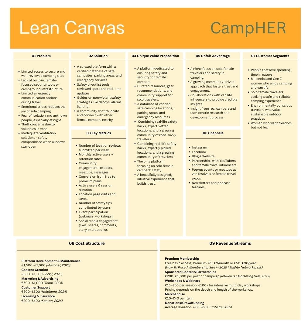
Problem
- On the final Lean canvas, we present seven problems of our target audience. To begin with, our interviewees stated that there is not enough verified sources that show secure and well-reviewd camping sites. Currently, they try to find places like that by searching for reviews online and seeing the ratings. It helps sometimes but in cannot be trusted completely.
- Another issue for our target group is the lack of built-in, female-focused security tools or campground infrastructure. There are not enough camping spots provided with security, which raises concern about outside people coming to the camp. The lack of built-in security tools in the van itself is also a problem, as it makes it harder to secure the van by themselves. That problem also connects to the theft concerns and inadequate ventilation. In case the weather is too hot, there are concerns about leaving windows open at nigh, as fear of theft ad break-in arise.
- There were multiple complains about limited emergency communication options during travel. Sometimes, connectivity may be lost, which would be a big problem for the campers in case of an emergency and no emergency services being close enough. The lack of tracking devices that work in those cases seemed to be a big problem.
- Finally, all of those problems contribute to stress that is stopping the campers to enjoy the moment to the fullest.
- Current alternatives for women interested in solo camping include blog posts, general camping apps, and social media communities. However, these sources often lack credibility, verified safety information, and a focus on the specific needs of female travelers. While platforms like Google Maps and national park websites do provide campsite details, they do not cater specifically to the concerns and safety priorities of solo female campers.
Solution
- We focused on providing foursolutions for our target group, the first one being acurated platform with a verified database of safe campsites, parking areas, and emergency services. That resolves the problem of not being able to trust sites like GoogleMaps and Blog posts.
- Second of all, we decided to provide the users with a growing network where users can share real-time safety updates, ask questions, and receive expert advice from experienced solo travelers tailored for solo female travelers.
- After conducting the initial interviews we found out that weapons and violence in case of a problem may backfire so we decided to give them uides on non-violent safety strategies like decoys, alarms, lighting etc.
- Finally, we made a community chat to locate and connect with other female campers nearby, which resolves the fear of isolation and fear of unknown people at night.
Customer segments
- Our main targeted age groups are Millennials and Gen Z women who love nature, camping, and road travel.Solo female travelers who prioritize independence, safety, and sustainable travel practices.
- Our ideal users are tech-savvy, eco-conscious, and safety-aware women. While some early adopters may already have solo travel experience and are now seeking more autonomy and a supportive community, Campher is equally designed for beginners and those who are just starting to explore the idea of vanlife. Whether they're seasoned adventurers or simply curious about taking their first steps into solo camping, Campher offers the tools, resources, and encouragement to make that journey safe, empowering, and accessible.
Unique value proposition
- CampHer is the only platform dedicated to the safety and empowerment of solo female campers. It offers a curated database of verified safe camping spots, parking areas, and emergency resources, alongwith real-world safety tips, approved locations, and gear recommendations. With a beautifully designed, intuitive interface and a strong, supportive community, CampHer builds trust and confidence for women on the road.
Unfair advantage
- Our brand's niche focus on female safety in camping makes it both highly relevant and emotionally resonant.
- Our brand aims to reach a growing, trust-driven community. By collaborating with van life influencers and development with real camper insights and user research, CampHer delivers a platform shaped by and for its users.
Channels
- Our main path to costumers are Instagram and Facebook, for community-building, storytelling, and brand presence.
- Our website as the main interaction point for features, resources, and memberships. Other channels include: blog and website, partnerships with YouTubers and female travel influencers, pop-up events or meetups at van festivals or female travel expos, newsletters and podcast features.
Key metrics
- Website engagement: number of visitors, page interactions, time spent.
- Community feedback via surveys and test sessions.
- Social media metrics: likes, shares, comments, and growth in followers.
- Number of website members that sign in on the platform.
- Number of location reviews submitted per week
- Number of safety tips contributed by users.
- Event participation (webinars, workshops).
- Conversion from free to Premium users
Revenue streams
- Our main revenue focus will be from our users. We will make premieum subscription which will provide them with discounts and givaways for our workshops and webinars. The workshops and webinars will consist of different activities and information that concern camping and will also help us build further our community. We will make merchandise that will include clothes and also camping gear and safety tools. Other revenue streams include partnerships with brands and influencers and donations.
- Premium Memberships: €5–€9/month or €50–€90/year.
- Sponsored Content/Partnerships: €200–€1,000 per post or campaign.
- Workshops & Webinars: €15–€50 per session, €100+ for intensive sessions.
- Merchandise: €10–€40 per item.
- Crowdfunding/Donations: Avg. €60–€90.
Cost structure
- Our main costs consist of salaries of our team. These are the estimated costs per month:
- Platform Development & Maintenance: €1,500–€3,000.
- Content Creation: €800–€1,200.
- Marketing & Advertising: €500–€1,000.
- Customer Support: €300–€500.
- Licensing & Insurance: €200–€400.
- Total: approx. €6,100
- Cost per unit estimate:
- First sub-bullet
- Second sub-bullet
Services/products
- Campher is a digital platform featuring verified campsite listings, real-time safety updates, a user forum and a community hub, educational content such as safety guides and travel tips, as well as premium memberships and event offerings. It has a strong alignment with values like empowerment, safety, accessibility, and nature. The minimalist visual identity and warm tone support a calm, trustworthy, and welcoming experience for users.
Validation of Assumptions
The name Campher fuses “Camper” with “Her”, ptresenting its female-centered mission while remaining playful and easy to remember. In comparison to existing platforms like "Hipcamp" or "Park4Night", CampHer stands out by being specifically tailored to women and by offering a community-driven support system instead of focusing solely on campsite listings. The goddess compass logo further enhances the brand’s differentiation by visually representing guidance and feminine empowerment, creating a strong emotional connection with the target audience.